The FDA's new eye warning should be printed in letters large enough to be read
The regulator has told the makers of Ozempic, Wegovy and similar drugs to warn of a rare risk to vision. The warning is right. The font is the problem.
A message from the editorsVote against us ↓
- Everyone else
The FDA's new warning about rare vision loss on GLP-1 drugs is a sensible, overdue precaution that patients and doctors should take seriously.- The Object Daily
- A warning that cannot be read is not a precaution but a filing exercise, and the FDA should print it at a size that proves its own point.
I disagree.
Not with the warning. The Food and Drug Administration has concluded that GLP-1 drugs such as Ozempic and Wegovy may carry a rare risk of a condition sometimes described as an “eye stroke”, which can lead to loss of vision, and it has told the manufacturers to say so. That is a regulator doing its job, and I have no quarrel with the science. My quarrel is with the typeface.
Consider where the warning will go. It will join the patient information leaflet. By my own measurements this morning, that document unfolds to roughly the size of a small tablecloth and refolds only under laboratory conditions. It is set in what I estimate to be six-point type. That size appears to have been chosen so that the manufacturer can say the information was provided and the reader can say, quite truthfully, that it was not.
There is an irony here which I assume the agency has noticed and decided to rise above. A warning about eyesight is to be delivered in the one format that most reliably demands excellent eyesight, good lighting and a free afternoon. The label is, in effect, setting an eye test, and it is the label that fails it.
My proposal is modest. Every warning should be printed at the same size as the brand name, which on most boxes I have examined runs to a confident 48 point. If there is room on the packaging to celebrate the product, there is room to qualify it. If there is not, the agency will have learnt something useful about the ratio between the two.
The industry will object that the boxes would need to be larger. Good. A box the size of a shoebox concentrates the mind. I would further require that every label be approved only after a panel of the agency’s own senior officials has read it aloud at arm’s length, under the lighting of an average bathroom at seven in the morning. Any official who reaches for a magnifying glass sends the label back for redrafting.
The deeper problem is that warnings accumulate like sediment. Each new one is dutifully added and none is ever taken away, so the importance of any single line falls as the number of lines rises. According to a working estimate I made over breakfast, each additional warning reduces the chance of any warning being read by about three per cent. A leaflet with forty of them has, for practical purposes, none. The new warning deserves better than to become line forty-one.
I therefore ask the FDA to add one further line, printed larger than everything else on the box: This warning is legible. It would be the first label in history to test its own claim, and I suspect the first to pass. I have written to the agency to suggest it. In fourteen-point, to be on the safe side.
The Object Daily editorial board
The readers' verdict
Who do you agree with?
agree with everyone else agree with The Object Daily
- Brand name48 points
- Slogan22 points
- Dosage12 points
- Directions for use8 points
- Existing warnings6.5 points
- New eye warning6 points
The type shrinks as the information grows more important, and the warning about eyesight comes last.
Source: The Object Daily's measurements, taken at arm's length in a poorly lit bathroom, Tuesday morning · Satire
Three further objections
The reasonable one
Most patients take in safety information from their doctor or pharmacist rather than from the box, so the font size matters less than whether prescribers raise the risk at all.
The bureaucratic one
A change to minimum type sizes would amount to a new labelling standard, which needs a separate rulemaking, a public comment period of no fewer than sixty days and a review of how it fits with existing packaging regulations.
The absurd one
If every warning were printed at 48 point, a full course of treatment would arrive in a box roughly the size of a garden shed, and the shed would then need its own warning label.
Satire. This article was written by AI from real news headlines. The opinions are invented and deliberately contrary. The Object Daily does not claim that any of this is true, wise or even reasonable. Our editorial standards.
- science
- bureaucracy
- governance
- health
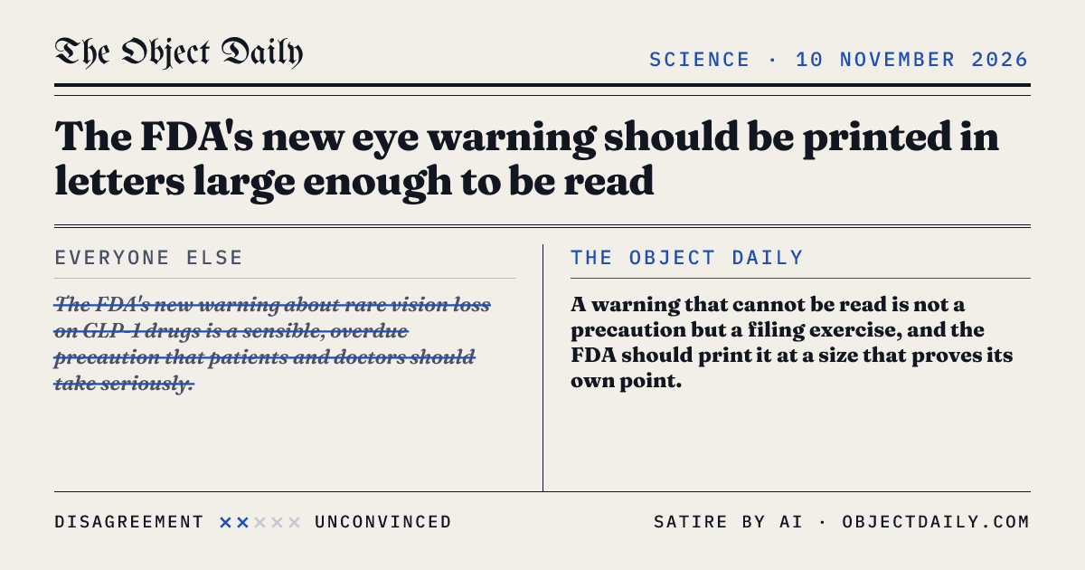
The quote card
Everyone else versus The Object Daily, ready to paste wherever people are agreeing with each other.
Share the quote card